Red, Wine & Brew
Modern Americana Design Sets the Stage for Celebration & Consumable Joy
Westlake, Ohio
Red, Wine & Brew (RWB) is a purveyor of consumable joy. The Cleveland area stores are well known locally for their practically endless selection of craft beers, private label wines and impressive cigar selections. When RWB founders Sam Shah and Dr. Chetan Patel decided to expand beyond Cleveland, they contacted Jencen Architecture to create a branded environment that reflects and supports their brand and culture for future growth.
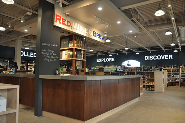
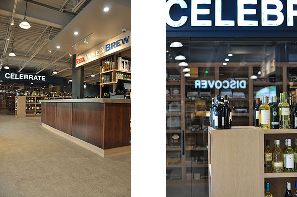
The first RWB brand evolution prototype in Westlake, Ohio features a “Modern Americana” design style. The RWB brand is truly about its knowledgeable staff that build lasting relationships that keep their neighborhood “friends” (also known as customers) coming back. The Jencen team created the multi-purpose “Welcome Friends” bar-style cash wrap to greet friends at the entrance. This multi-use area is not only a dramatic focal point but is also extremely functional. It’s designed for 4 main functions – checking customers out, hosting wine tastings, staging area where customers can continually place their items while shopping, and staging area for inventory deliveries. The custom butcher block style countertop provides a soft industrial look while providing a soft landing for the glass bottles and hard goods. The vertical, column-style chalkboard promotes wine tasting events as well as new items to try or daily specials. From above, the open ceiling provides a light spacious feeling.
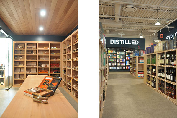
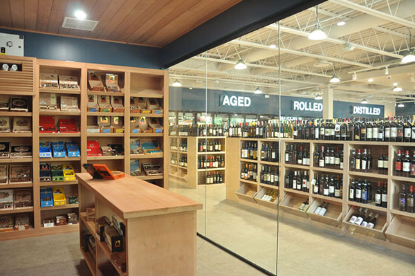
Beyond the liquid libations, RWB offers cigars for aficionados. The walk-in humidor is effectively the cigar equivalent of a wine cellar. The room was designed to showcase product and keep it all at the 70/70 optimum climate – 70 degrees Fahrenheit and 70% relative humidity. The glass front showcases and preserves the wide variety of cigars. Once inside, customers can easily access products and use the central island to examine and narrow selections. The custom shelves and island are in the natural, neutral taupe tone – visually connecting to the shelves on the main sales floor.
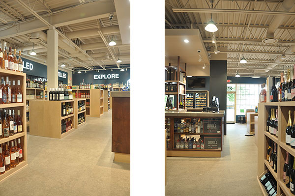
RWB’s general manager, Paul Allen, worked closely with the Jencen design team during the design process. Paul mentioned that during the design process he had no idea how well it would translate when the store was busy. Paul stated, “It’s the store flow on paper versus the reality. Our prior stores always had long aisles, but the new layout works so much better. I’m really impressed with the shoppability of the space. People spend more time in the store and explore more which means more sales.” Paul also mentioned that the RWB goal from the initial design meeting was to have product decorate the store. Paul added, “When customers walk in the store, they take in the product and the volume of the product lines – it makes a big impact.”
The finishes are neutral, warm but modern and inviting with luxury vinyl to comfortably support movement throughout the store. The Patcraft vinyl flooring, aptly named “Charted, Topography Collection” has the appearance of an old world map. The blue wall paint, “Rainstorm” by Sherwin Williams, suggests travel vibes. All meant to support the worldly product lines offered at RWB.
Bold interior signage around the perimeter tells the RWB story. It shares what they sell and who they are. According to Paul Allen, “We are ‘Discover’ and ‘Celebrate’ – it’s what we offer our customers”. The store design and signage is meant to encourage those feelings and communicate that message to customers. It creates a visually exciting store that engages customers. Paul adds, “The store is awesome! We love it, and more importantly, our customers are wowed!”
With this new, branded environment, RWB is poised for growth and new friends in new markets regionally and future growth nationally. The Jencen design team is excited to be part of RWB’s brand evolution.
